Here it is - the last of the War in the Pocket GM variants:

It’s not the same as having a full set of War in the Pocket Gunpla, but it still gives a sense of satisfaction to complete this “sub collection” of mobile suits.
About the Visual Design
I’m not a huge fan of how the standard GM Command looks. It’s tan and grey color scheme is boring, and it lacks interesting weapons. The only thing it has going for it is its backpack.

I feel much more positive about the Space Command. It’s yet more proof of just how much of a mobile suit’s look comes down to its color scheme. Backpack aside, this is the Exact. Same. Suit as the GM Command. But put it in a bright, crisp, bold color scheme, and suddenly it looks like something special. And while the backpack may not look quite as tacticool as the GM Command’s, it certainly looks more powerful, what with all of those extra thrusters:


Toss in its fairly interesting (and completely unique) weapon, and the Space Command ends up looking and feeling like a much bigger deal than its counterpart. You start to see exactly why in-universe pilots would mistake this for a Commander-type unit.
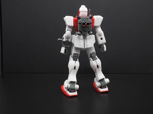
Articulation and Posing
I didn’t go nuts with poses. We already know what the articulation is like (and if you don’t, you can read about it here). And sadly, because this is such an old kit, there’s no easy way to prop it on a modern Action Base.

That really stinks, since the Space Command is supposed to fight in, you know, outer space.

But it’s okay. I’ve come to peace with the fact that some builds are going to have bigger, better photoshoots than others. As long as I can get a few quality shots, that’s all that matters.


Comparison with its Siblings
Now we can finally make a true comparison between these three sibling GM’s:

So which one is the best? Obviously it’s a tossup between the Space Command and the Cold Districts, but it’s not an easy choice.
On one hand, you have the Space Command with its clean color scheme, and its sleek, high(er) tech look.
On the other hand, there’s something about the color scheme of the Cold Districts that just speaks to me. It manages to look icy cold without a hint of white or blue, while also feeling like such a straightforward, highly appropriate color scheme for a grunt unit.
Furthermore, I like how it has a bit of an old school feel, what with its boxy shield, Crotch V, and its more traditional GM head.
You know what? It’s a toss up. I can’t choose between them.
Comparison with the King
Even though they share some common parts, the Space Command’s got nothing over the GM Sniper II.

Comparison with the OTHER King
Nor does it have anything on the bulky, toughass-looking GM Custom.

Comparison with the OG
It’s easy to see how one might mistakenly assume that the original GM is supposed to look like the Space Command. They both have red in all the same places.

Eternal Enemies
Better watch out Space Command - your arch nemesis appears!

Conclusion

It’s nice to finally knock this one out. It’s a simple, solid design that met my expectations.
And while I hate that I made some mistakes, I also feel like I did a better job than usual at fixing them without turning them into unmitigated disasters.
Other Thoughts
Is it sad to say that, despite being outnumbered here, I still think the Zeon boys have a chance?
