Head
The head is made up of at least nine pieces, which is almost double the count of some of the simpler High Grade heads I’ve assembled. I forgot how fun and challenging it is to try and assemble such tiny pieces in a particular order, without dropping, breaking, or damaging any of them.

The instruction manual shows “before and after” photos of the head, one in which it is plain, and one which is panel lined. The difference is stark, perhaps more so than any other kit I’ve built. There aren’t a done of lining grooves, but the ones that are there are vital to making the head stand out. I think I did a pretty good job of replicating the “after” photo.

In terms of design, the defining trait of the Proto Zero’s helm is the two pieces on the side, which kind of look like elf ears to me. They’re fairly important to the look of this mobile suit. Both these pieces and the extra wide V-fin give the head some necessary width. Without them, there’d be a lot of dead space between the head and the shoulder mounted guns.

Beyond these pieces, the helm is fairly conservative. It doesn’t deviate all that much from the traditional Universal Century style, which is fine by me.
Arms
The arms are easily the most functionally important part of a mobile suit. You could build one without a head, and we’ve seen some without legs, but without arms they wouldn’t be very versatile as fighters. For this reason, most mobile suits have very simple arms. Specifically looking at Gundam type units, they’re generally very square and boxy, with only the occasional extra flourish. And yet whenever I build the arms of a model kit, they always take far longer to assemble and panel line than I anticipate. They’re the only part of the build that always feels like a chore to me.
That wasn’t the case, however, with the Proto Zero. These are some of the simplest arms I’ve come across. The inner frame is very rudimentary, and the armor consists of three “shell” pieces that slide right on. That’s it. Compare this to the Real Grade RX78-2, which uses multiple, tiny armor plates on all four sides, for the sole purpose of adding some grey/white color separation. The Proto Zero is not nearly as sophisticated when providing color separation. It simply makes two pieces blue, and one white.

The arms feature not one but two dry decals each. The dark blue plastic made it hard to figure out when they were set straight, so the two decals on the back are a bit crooked.

Assembling the arms was far trickier than you might expect for such a simple setup. All the pieces have to line up in a specific way, but they’re all square, so they each fit no matter what direction they’re facing. It is very easy to slide one or more pieces on the wrong way.
It is also, apparently, all too easy to position the joints so that they accidentally bend backwards rather than forwards. Between these two mistakes, I had to reassemble both arms three times times before I got them right.
Manipulators
The Proto Zero does not come with a pair three finger/trigger finger split manipulators, and I don’t know why. They aren’t a recent invention - Every single Real Grade I own has them, and most of those are older than this kit. The split finger setup is my favorite kind of manipulator, since they can be used for every situation you can imagine. I figured they’d be a no brainer for any Master Grade build.
As a matter of fact, the Proto Zero comes with just one pair of “base” manipulators, consisting of a palm and a ball-jointed thumb, alongside a collection of attachments that put the remaining fingers into various configurations. Aside from the thumb, this is similar to the way most High Grade kits work, and to be honest I expected a little more. I suppose I shouldn’t judge until I actually have to pose the kit, but I don’t like what I see.

Also of note is that the armor that goes on the outside of the manipulators is grey, the same color as the hands themselves. I did a double take the first time I saw this, but as far as I can tell, this is actually accurate to the original design.
Shoulders
The shoulders were much more fun to work on than the arms. They were also a lot harder. Not all the decals on the shoulders are mirrored front and back, so you have to constantly be aware of which side of which shoulder you are working on at any given time, so as not to apply the seals in the wrong place.
They’re also complicated, in a way that is quite different from my previous Real Grade kits. There are quite a few smaller pieces which sit in between the two main halves of each shoulder, all of which move around independently of one another. I had to be very careful not to misplace of any of them, and even more careful when assembling them.

When finished, the shoulders certainly do look busy, but they’re also quite impressive. There’s a lot going on here in terms of details and articulation, so much so that I’d say that this is the first instance in which I felt like I was building something that was truly more complicated than any of my previous kits.
In terms of gimmicks, you can store the beam sabers in the shoulders like so. A small peg ensures that the saber hilt stays in place.

I should also note that the shoulders attach to the frame via a set of rails on the inside of the armor. This allows them to slide left and right, as well as move up and down. Seems this is necessary in order to accommodate the kit’s transformation mode, though I suppose you can also use it to position the shoulders the way you like while in mobile suit mode. Just be sure the arms are attached as securely as possible to the torso, otherwise the shoulder armor will fit loosely and flop around.
Painting redux
I went back and applied a fresh coat on the shield. So far, it looks to have removed the discoloration I previously reported on.
I also applied a fresh coat on one of the two guns, as it started to look grossly discolored compared to its partner. This did not go well at all. On the “inner” side of the gun (the side that is hidden when the rifles are joined together) there were what appeared to be bubbled up paint all along the top. I tried gently scraping them off, but it made things worse. Either this piece is absolutely caked with paint, I somehow managed to carve several shallow pits into the plastic, all of which looked cloudy and warped. I ended spraying it down one more time; the pits are still there, but they’re back to looking muted and dull grey.

I have two thoughts about this fiasco. Firstly, the damage isn’t visible if the guns are attached, so I’m not too worried. Even if I pose it with the guns separated, I can easily rotate it so that the damaged side is pointing toward the floor.
Secondly, I’m starting to think I shouldn’t bother topcoating weapons any more. I don’t know what it is about the kind of plastic they’re made of, but it always reacts to paint in ways I would never expect.
Other Thoughts
I’m not going to backtrack my comments about the overall improvements in this version of the Wing Zero, but there are certain aspects of its look that not even Katoki can fix without drastically altering the unit’s design. In this case, I’m talking about the color scheme. It is way too busy. The shoulder armor alone contains four different colors, and in all honesty I can only ever remember two of them. If you count the color of its decals, then the arms use three different hues. The chest boasts five, unless you count the bits of grey poking out, in which case it goes up to six.

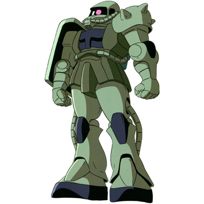
This is where I embarrass myself talking about mobile suit design. Take a look at a suit like the Zaku II. It isn’t monochromatic, but it is certainly close. You would expect that all the details would blur together in that sea of green body parts, but that isn’t what happens. The Zaku is instead one of the most iconic designs in all of anime. It achieves this by creating a strong and distinct silhouette. Your eyes are drawn to all of the intricate shapes and curves of the unit, rather than on any small, up close details.
On the other hand, protagonist mobile suits (aka Gundam types) take the opposite approach. Their silhouettes are straight and boxy, so they have to focus on the little details. Generally this is done through the use of color. The upper body may primarily be blue, for example, but little vents or ports will be yellow or red. These bits pop out and draw focus to individual parts of the body, which in turn allows you to zero in on them and pay attention to other smaller details you may have otherwise missed. The key here is to show some restraint. Just a hint of color can do a world of good.
Wing Zero doesn’t have the straight and boxy look of other Gundams, so in theory it should need even less color differentiation than usual. Instead it gives us even more. You look at the torso area, and not only is your brain processing all the intricate shapes, but also the fact that those shapes are broken up into multiple, distinct colors. It is a lot to take in all at once, which makes it hard to keep track of/remember everything. I’m starting to see why I used to get the designs of the Wing Gundam and Wing Zero mixed up in my head.